The Most Popular Living Room Colours
Painting is the quickest and simplest way to change the mood of a room. Over the past year, with people spending more time inside their homes, we’ve seen how important it is to have the right atmosphere in your living room. Home interior trends in 2021 focused on comfort, sustainable luxury and nature. This brought colours that are restful, soothing and natural – greens and warm neutrals replaced cold greys, blues became softer and dusky pinks were combined with warm greys. You only need to take a look at Pinterest and Instagram to see why these colours have become so popular this year.
Here are the most popular living room colours, so you can achieve the right mood for your home.
Little Greene’s Colours of England
Little Greene have recently refreshed their ‘Colours of England’ and ‘Colour Scales’ colour cards, which feature important colours from the last 300 years of interior decoration.
They’ve added Obscura, a pale blue-grey neutral tone which pairs beautifully with natural floor textures, like jute and coir. This colour is delicate enough to be used on its own or among a colour palette. There’s also Etruria, a mid-tone blue which reminds us of sea-side towns. This colour was inspired by the ceramic work of 18th- century potter Josiah Wedgewood and echoes ancient Greek pottery. These shades of blue bring a sophisticated and calming effect to your living room.
Little Greene also has three shades of Silent White neutrals making it simple to match the tones in your room, from the walls to the internal doors. The warmth across this palette means you can have a truly neutral lounge without it feeling stark or cold.
Image: Ceiling in Silent White Pale 328, Walls in Silent White Deep 331 in Absolute Matt Emulsion £48.50 for 2.5L, Panelling in Silent White 329 in Intelligent Eggshell £68 for 2.5L by Little Greene. Stockist no 020 7935 8844 www.littlegreene.com
Farrow and Ball’s California Collection
The California Collection from Farrow and Ball is the perfect example of on trend colours. Inspired by the landscapes of the Golden state, it includes warm greys with sand and terracotta tones, reminiscent of desert highways.
The collection is lifted with Citrona, a punchy lemon yellow with earthy undertones. Yellow can be an intimidating colour, but this shade will instantly brighten your living room without giving you a headache. If yellow isn’t your thing, you can stay on trend with Palm, a fresh green inspired by the iconic LA palm trees and Hazy, a muted blue-grey which encapsulates fresh mornings by the sea.
All these colours will help you capture the natural environment trend we’ve seen recently in interior design and will reflect the laidback lifestyle of California.
Fired Earth’s Latest Colours
Fired Earth have recently added 12 gorgeous new shades to their collection. Warm neutrals like Morchella help to create a welcoming and restful room and work great with dashes of nature-inspired decoration.
Selva is a rich dark green, bringing all the colour and ambience of houseplants without the maintenance. This shade of green has proved popular recently, being used for feature fireplaces and kitchen cabinets. You can use it in your living room as an accent or for every wall, depending on the mood you’re looking for. It pairs beautifully with wood tones and perfectly captures the relaxation of a nature retreat.
Prehnite, a lively green shade, is another new colour which is in contrast with the calming feeling of Selva. This is an invigorating shade that we’re seeing more and more in interiors. It can freshen up your living room instantly and really stands out when paired with rustic decorative touches.
Dulux’s Expressive Colour Palette
Dulux’s colour of the year for 2021 is Brave Ground, a warm earthy tone which is right on trend. The shade brings stability and balance to a room and can be put together with other neutral tones or something brighter.
Brave Ground features in Dulux’s Expressive Colour Palette, alongside dusky pinks, grey-toned corals and shades of terracotta. When combined with Brave Ground, these colours really stand out, and look best with modern furnishings and graphic patterns. The pink tones in this palette mean you can add some bold colour to your home in a grown-up way – and pairing it with Brave Ground will mean you can really stay on trend.
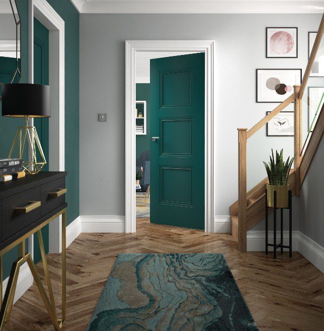
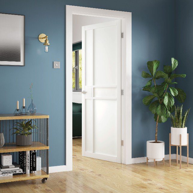
Colour is so important in interior design and it’s not just the walls that can have an impact. The colour of your doors is key to setting the tone of your room.