10 Designer-Approved Interior Colour Schemes to Use in 2024
Selecting the perfect colour scheme for your interior design project is a crucial step in bringing your vision to life. The shades you pick will help to set the tone of your room, shaping the mood and atmosphere, all while expressing your own personal style.
If you need some inspiration, here you’ll find 10 outstanding colour schemes that will revitalise your space. From timeless classics to bold contemporary palettes, we’ve handpicked a diverse range of colour combinations to suit every aesthetic preference.
Ocean Blues
Ocean blues and a coastal interior are popular for good reasons. Shades of blue, especially those reminiscent of the ocean, are known to be associated with feelings of calm and tranquillity. They can make for a gorgeous, peaceful space.
With an ocean blue colour scheme, you’ll have a vast choice of shades, from soft pastels to deep, dark hues. Utilising different shades of one colour will add depth to a room, allowing you to keep a seamless look whilst benefiting from the variety of blue and green hues in each shade.
Sage Green and Blush Pink
For an elegant, feminine finish, combine sage green with blush pink. These two shades might not be what you first think of for a colour scheme, but they’re a perfect pairing for just about any room of the home.
Both shades offer a soft, contrasting finish while also delivering a fun environment. It’s a great choice if you want to add something a little different to your interiors but you’re not a fan of the bold bright colours. This colour palette looks beautiful when combined with floral patterns, as both shades will be found in nature. If that’s a touch too fussy for you, you can keep it simple with clean lines and block colours.
Hunter Green and Rich Red
“Red and green should never be seen”? We don’t think so. Hunter green and a rich red shade offer a timeless elegance, bringing a sense of charm and sophistication to a space. Red and green are complementary colours, so they deliver a visual interest to a room. The deeper shades of a hunter green and rich red create an opulent space and elevates the shades above simply a Christmas theme.
The warmth and depth of the hunter green will ground the space, whilst the rich red will lift and add intensity. Combine with gold or brass hardware, or deep, rich wood furniture to continue the feeling of luxury throughout the room.
Earth tones
Earth tones include hues that we see in the world around us, from deep browns to sandy beige and even rich terracotta. Using this colour scheme helps to take us closer to nature, bringing a sense of calm and comfort to a room.
Earth tones are truly versatile and can be used with a range of interior styles, such a more minimalist looks, to bohemian designs, and rustic spaces. Using different shades and patterns will help to prevent the room ever feeling flat. You can also use artwork and pops of colours – maybe a brighter orange or green to maintain the connection to nature – to add more visual interest. Alternatively, stick to calm neutrals for a soothing finish.
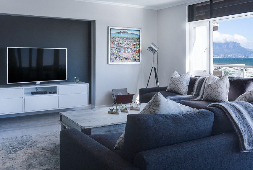
Cool Navy and Crisp White
If you crave balance in your interiors, cool navy and crisp white is the colour scheme for you. Not only is this a chic, sophisticated combination but the overall look is one of peace and serenity. This colour scheme works just as well in spaces where you need productivity and focus, such as your home office, as it does in cosy, restful rooms such as the lounge. This colour scheme works with a variety of designs, but is well suited to more classic interiors, ranging from coastal to opulent.
The warm white shade will keep the space grounded whilst elements of cool navy will add depth and character. The crisp white will stand out against the deepness of the navy and will look its best in rooms with plenty of natural daylight.
Dramatic Black and Wine Red
If you’re looking to add some drama to your space, black and wine red is the colour scheme you need. This scheme will help to create a cosy, cavernous feel in a room, which can be a benefit. However, with two darker shades it’s important to get the lighting right, whether with ample natural light or light fixtures and lamps.
Black and wine red will bring a sense of luxury to your space, so you can enhance this with your accent pieces. Think vast floral murals that stick with the colour scheme, plush velvet fabrics, and dark hardwood floors. If that feels a little too much for your tastes, you can still utilise black and wine red, but use clean, geometric shapes for fabric patterns and artwork instead.
Organic Greens
An organic green colour scheme is ideal for bringing the outside in, and capitalising on the recent trend for green shades in our interiors. Greens are truly versatile and give you a vast option for shade choices, from soft yellow-green shades to richer blue-greens and everything in between. To really achieve the organic green feel, opt for shades with subtle grey undertones.
Combine an organic green colour scheme with natural textures and patterns to continue the nature connection. House plants are a simple way of adding visual interest to a room while keeping to the colour palette – you could even start with your favourite house plants and choose which shades of green you decorate with from them.
Inky Blue and Bright Gold
Deep, inky blue and bright gold is a colour scheme that’s taken Pinterest by storm in recent years. The metallic gold tones are accentuated beautifully when put against the dark blue shade. Blue and yellow are contrasting colours, so the use of gold in this scheme allows us to benefit from the pairing while adding a sense of elegance to a space.
Inky blue and bright gold can work in any space but looks especially striking in rooms where you can make the most of gold hardware. So, think about using the scheme in the kitchen or bathroom – inky blue cabinets with metallic gold handles, gold taps, and even gold light fixtures. If bright gold feels a little brash for your tastes, look for burnished gold fittings for a more subtle aesthetic.
Warm White and Punchy Raspberry
If you enjoy the simplicity of a white interior but still want to add some vibrancy, warm white and punchy raspberry may be the colour scheme solution. With this combination, you can choose how much of a statement you wish to make.
Painting all the walls white and then opting for raspberry accents can be a great way of adding some character to a room. You could really think outside the box for this – think an ornate raspberry chandelier, side table, or dining chairs. Or you could make more of a statement with raspberry pink walls and white furniture – just add some raspberry accents here and there to keep it cohesive.
Sunrise Shades
Sunrise Shades is looking to be a staple of 2024 interiors. This colour scheme includes shades such as apricot, peach, mustard, and vibrant orange, all reminiscent of a sunrise. Interiors with this shade are warm and nourishing, bringing effervescence and energy to a space with the brighter shades but keeping it soft and subtle with the pastel hues.
This colour scheme can help to lift smaller spaces or rooms that don’t get much natural light, bringing a sunny disposition that might be well-needed. You can use neutral shades such as creams and whites for accent colours to add more dimension to the space.
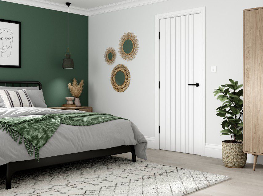
JB Kind has a range of interior doors perfect for your interior design project, including coloured internal doors to keep you on trend with your chosen colour scheme. Download our brochure or contact us to find out more.